Logo Seisema
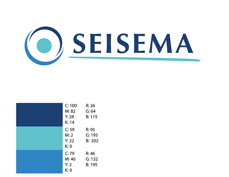
Logo for Seisema, a brand that required a modern and professional visual identity to reflect its values and services. The logo was crafted to communicate trust, innovation, and dynamism while maintaining simplicity and versatility for various applications.
Key Features of the Logo Design:
- Typography:
- Utilized clean, serif-inspired typography to convey professionalism and reliability.
- Integrated a streamlined underline for a sense of motion and modernity, aligning with the brand’s forward-thinking ethos.
- Symbolism:
- Designed a circular icon symbolizing unity, balance, and inclusivity.
- The inner circle represents a focal point or target, embodying precision and focus, while the encompassing curve adds dynamism and movement.
- Color Palette:
- Selected a gradient of blues to convey trust, stability, and clarity.
- Incorporated lighter tones for a fresh and approachable look, balancing the overall palette.
- Versatility:
- Designed the logo for optimal adaptability across digital platforms, print media, and other branding materials.


